I've recently heard a great analogy that technical analysis is basically astrology or art for the stock market. This is not far from the truth as technical analysis purely depends on people's ability to interpret patterns on charts and usually has a high margin of error. It's a probability game.
Technical analysis on charts does work, but not as you may expect. There's no magic solution. You can't just add as many indicators as possible on a chart and say you've found the holy grail.
In all these years, I've read countless trading books, created bots to trade specific trading strategies based on indicators, and the truth is that they didn't really work. Yes, they all say it's a numbers game and they all promise good results, however, the reality is they are just overfitted strategies backtested in very specific market conditions on specific instruments.
I tend not to solely rely on indicators anymore, but there are a few tools I still use every day and they keep surprising me how accurate and useful they can be at times.
What is technical analysis?
Technical analysis is a form of forecasting future price movements and finding trading opportunities by identifying trends and looking for patterns on charts. The most popular techniques make use of tools like support and resistance, trendlines, chart indicators, price action, and many more.
However, this is a very broad term that bundles a lot of different ways of analysis, from chart pattern indicators to algorithmic trading. That's probably why people call this astrology, as all those strategies out there are not consistent enough to use them as a standalone way of making money.
There are a few more respected ways to do technical analysis that are purely based on price action. Support, resistance, volume, and momentum.
The secret is that you don't need all the complicated fancy indicators out there for you to be able to predict the movements. You just need a few simple tools, and why this works is simple... if everyone sees the exact same pattern as you do, then they most likely make the same decisions causing the price to react and move in the expected direction.
Support and resistance ( supply and demand )
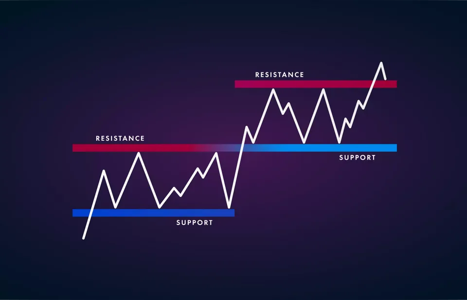
Support and resistance are the most used technical analysis techniques based on a simple concept. It represents the levels where the price has historically reacted to. They act as barriers, and price movement usually slows down or reverse around those areas. This is due to the law of supply and demand.
A support level is usually around a price where there is high demand, naturally stopping the price from going lower. The lower the price, the more people want to buy that particular good. Also, as the price goes lower, you will see fewer people willing to sell, reducing the supply. As a result, the price reverses and goes back up until it reaches enough supply.
A resistance level is around a price where there is a high supply, naturally stopping the price from going higher. The higher the price, the fewer people will demand that good leaving the sellers with an increased supply. As a result, the price reverses and goes back down until it reaches enough demand.
It is a simple concept, although people often find it hard to draw those levels on the chart as there's usually a lot of noise in the price action. I personally find it easier to draw those levels as an area rather than a horizontal line.
As my rule of thumb when drawing support and resistance zones, if the price action reached an area more than two or three times, then it can be considered a good level. The secret here is to not search too hard for them.
Remember, for those levels to be effective, they have to be obvious for everybody. You don't have to be an expert to draw them. Just look on the charts and if a particular zone stands out the most then you can be certain that everyone would have that area drawn on their charts as well. If they see it too, they're more likely to take the same decision as you do.
Take a look at this year's chart for SOFI stock. I have drawn these levels since the beginning of 2021. I have identified the support around $15 and the resistance around $25 then drawn two rectangles marking those areas.
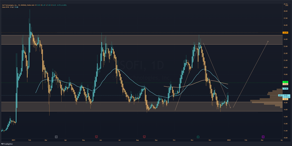
Look at how many times the price bounced from those levels in a year. These areas will continue to act as a price barrier for years to come unless major catalysts force the price to break any of those levels.
I encourage you to do this exercise for every stock you trade. Try drawing your own support and resistance levels on charts, and you'll be surprised how many times the price will react to your levels in the future.
Heikin Ashi
As you can see in the chart above, my candlesticks look different and smoother than the standard candlesticks. This is because I use Heikin Ashi, which is simply a different formula for calculating the candlesticks using averages instead of using the open, high, low, and close like standard candlestick charts. This gives the chart a smoother appearance eliminating the noise, making it easier to identify trend reversals and drawing support and resistance.
Dynamic Support and Resistance
One other indicator can be very useful in spotting support and resistance, and that's the moving average.
The moving average is a simple chart indicator that plots a constantly updated average price taken over a specific period of time. This is also useful to smooth out the price action and eliminate the amount of noise you see on a chart.
The most useful MA for dynamic support and resistance is the 50-day moving average and the 200-day moving average. The higher the period, the stronger the level.
Trendlines
As price often trends upward or downward, it's not uncommon for those horizontal barriers to be broken. In an uptrend, when the price breaks resistance, that level becomes support. This creates what it's called higher highs and higher lows.
A trend line usually has a slope formed by connecting two or more low or high points. You typically want to connect at least three points to have a valid trendline. These trendlines also act as support and resistance however, I find that they are usually weaker depending on how steep is the slope.
Volume
The trading volume indicator is a very useful tool when you want to see how many shares have been traded in a period of time. Looking at this metric will help you understand the strength of a particular price movement.
When used in conjunction with key support and resistance levels, the volume will show you how strong is the supply and demand when the price reaches these areas.
As my personal favorite, I use what's called the volume profile. Instead of showing you the volume for a particular day, it's a horizontal indicator showing you the trading volume around a particular price level during a fixed period of time.
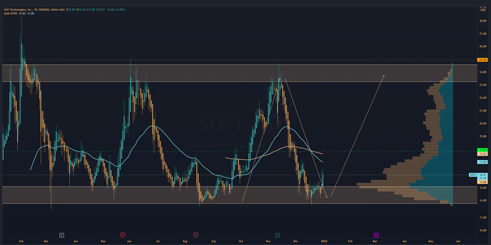
Retake a look at my SOFI chart above. I have plotted the volume during a period of 200 days. See how well it coincides with the support and resistance zones and how much people have traded this stock around the $15 area. This gives you more confirmation that people really like jumping to buy this stock when the price reaches $15, driving the price higher.
Momentum
The price momentum indicates the speed of price changes or volatility over a period of time and helps investors determine the strength of a trend.
There are many indicators out there that measure momentum, and the most common indicators are the relative strength index (RSI) and moving average convergence divergence (MACD).
The MACD measures the relationship between two EMAs (exponential moving averages), while the RSI measures the price change in relation to recent price highs and lows. They are both measuring momentum, but they sometimes give contradictory results because they measure different factors.
The idea behind momentum is that if price momentum slows down when it comes near a support or resistance area, then it is more likely for the price to react around those levels and bounce off them. If momentum is high around those levels, it is more likely for the price to break those levels and continue in the direction of the trend.
I don't rely on those indicators very much, but they can provide extra confirmation and help you make better decisions when used with all other tools I mentioned.
Conclusion
Technical analysis is a real thing, and it does work. Stick with the basics and leave complicated chart patterns behind. Try to understand reading the candlesticks, support, resistance, volume, and momentum, and you'll have an extra edge when making your decisions whether to buy or sell a particular stock.
As an added bonus, I love to use those tools to determine what strike price to choose when selling options. If you like to know how I make passive income selling options check out this article below.
 Johannes Dragulanescu
Note that even if the technical analysis may give you an edge, this doesn't mean you should start trading every stock you find out there. Combine these tools with your fundamental research, and you'll have much greater success in your investing journey.